
If you’ve ever watched a TV show or movie about the workplace, chances are that you’ve seen some sort of project management chart.
Yeah, the kind of charts where people create a bunch of tasks and then put them into color-coded boxes on their computer, and then wait for the line to be green so they can yell “Yay!” or something like that.
I don’t know exactly what all these charts are called but we’ll just call them “project management charts,” although if you want to get really specific you might say they’re called PERT charts or something like that. Except when they’re called Gantt charts but more on that later.
Well, what are they good for? What makes one better than the other? When is it best to use one vs. the other? The answers may surprise you.
Table of Contents
Know what a PERT Chart is?
A PERT Chart is a graphical representation of the project schedule and shows the relationship between the various tasks and their durations. It is used to estimate the time required to perform a project or a task.
In this method, each task related to the project is assigned a critical path. The critical path represents all those activities that must be completed before other activities can begin (or continue) as depicted by arrows in a diagram. The sum of all activity times must equal the “total project duration” (time taken for completion).
PERT Charts are used primarily when dealing with uncertainty or risk mitigation because they allow you to plan ahead even if things change during execution! Additionally, they can help you keep track of performance so that you know if your team has been successful at meeting deadlines throughout the execution time period(s).
Know what a Gantt Chart is?
Gantt charts are used to show the project schedule and the project tasks. This type of chart is mostly used for small projects that contain a minimum number of tasks, resources, and durations. It is also used when you want to keep track of your daily goals or deadlines until the end of time (or at least a few months).
Gantt charts can be created using Microsoft Project software or any other spreadsheet program such as Excel. The GANTT chart consists of two main sections namely:
- A timeline that shows how long each task will take and when it will start/end.
- A table with rows for each resource name and column headers that include information about each task such as its duration and start date/time/etc.
PERT Chart v/s Gantt Chart – The Difference
1. Gantt Chart is based on Project Management Theory.
Gantt Charts are based on Project Management Theory. Developed in 1910 by Henry Gantt, a Gantt chart displays each task required by a given project linearly.
Using this timeline view, you can easily determine the expected duration of each task (as well as the overall project). In addition to visualizing the order of specific tasks, Gantt charts also allow you to identify the individuals and teams responsible for each one.
Gantt Chart is used to display the project schedule, plan or schedule tasks and manage project resources. It is helpful in identifying the critical path of a project.
2. PERT Charts use the critical path method.
The US Navy first proposed a PERT chart in 1957, but it wasn’t widely used until about 30 years later when there was a surge of interest in project management practices.
The PERT Chart uses the critical path method to determine the longest path through a project. The critical path method is used to determine the earliest completion date, latest completion date, and earliest start date.
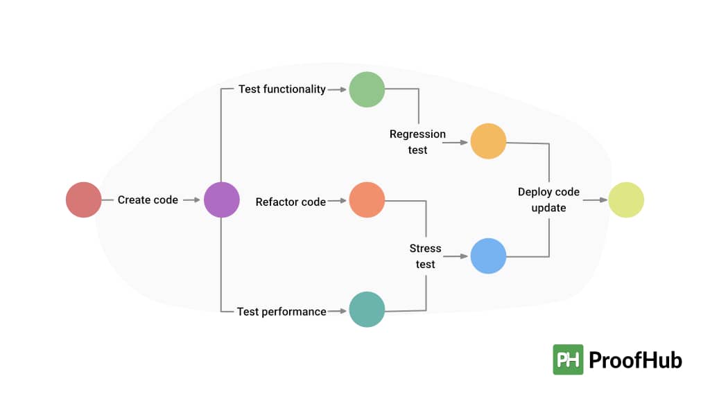
The critical path method is a network analysis technique used in project management to identify the minimum time required to complete an entire project. This technique seeks out activities that are directly related to each other and calculates their duration (start-to-finish) based on dependencies between them. If an activity does not have any dependency then it is called independent activity or non-critical activity because they don’t add up to any delay in finishing off other tasks of projects at hand. However, if there exists some dependency then those tasks will be considered as “critical” activities or simply “critical paths”.
3. PERT Charts can be used to plan tasks.
PERT Charts are used to plan a project. They are more suitable for projects with multiple tasks, milestones, or deliverables. The PERT Chart should be created using the following steps:
- Select activities required for your project
- Determine their sequence or order of completion
- Estimate each activity’s duration (how long will it take you to complete it?)
- Add an optimistic estimate (best-case scenario), most likely estimate (a most likely scenario), and pessimistic estimate (worst-case scenario). These three estimates are known as: E(xpected), M(edian), U(nder-run).
If you add up all the expected durations and divide that sum by 6 then your calculations will always fall within 80% – 120%. If your calculation falls outside this range then something could be wrong with your estimates!
4. Gantt Charts show the project schedule.
In a Gantt chart, the tasks are listed in chronological order along with their durations and dates. The horizontal line is known as the “bar” while vertical lines represent each task or subtask. The only thing that can be seen in a Gantt chart is how your project will be scheduled throughout its duration, but there is no information about how well it’s being executed on a day-to-day basis.
Know which chart to use, and when!
Gantt Charts and PERT Charts are two of the most widely used project management tools. Both are great for planning your project, but there are some key differences: Gantt charts use a theoretical approach and show only the schedule, while PERT charts use the critical path method to calculate how long each task will take.
| PERT Chart | Gantt Chart | |
| Project Scope | It is recommended to use PERT charts during the planning phase of a project, as they allow users to map | Gantt charts are more helpful once a project is underway, as they can be adjusted if the scope changes. |
| Timeline | It is based on a particular formula that PERT charts calculate | By using a Gantt chart, activities are planned and scheduled, allowing notifications when a timeline has been missed. |
| Flexibility | PERT charts are challenging to change mid-project, making them a less flexible option. | Projects and plans can be changed more easily with Gantt charts. |
| Task Assignment | Using a PERT chart allows team members to quickly see which tasks are dependent on each other and who is responsible for what. | Gantt charts tend to be very large and complex, often requiring team members to scroll through many pages in order to see the big picture. |
To know which chart to use and when it is important to understand the difference between these two types of project management charts.
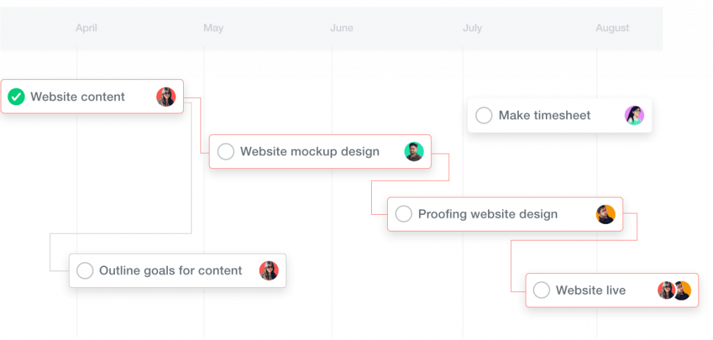
Why use the Gantt chart view in ProofHub?
Gantt charts are great for project planning. They help you to stay on track and plan better by giving you an idea of what needs to be done, who will do it, when they need to be done, and how much it will cost.
Gantt charts are great for project presentations. It helps in presenting the status of a project by providing a visual representation of the schedule in the form of bars or rectangles with time codes on them so that everyone knows exactly where he/she stands in terms of completion with respect to others working on similar tasks; this makes it easier for teams to work together as one unit rather than as individuals who may not understand each other’s roles perfectly well even though they might be working on similar tasks themselves.
Gantt charts are great for project management because managers can use the Gantt chart tool effectively when communicating their goals and expectations about projects being completed within certain time frames; by using Gantts, managers can ensure that employees get clear direction regarding objectives without having any miscommunication issues arise later down the line during implementation stages (such as workload distribution). This helps us all know exactly what needs doing now while also helping us identify potential risks early enough so they don’t become big problems later down the road.”
How to create a Gantt Chart in ProofHub
Creating a Gantt Chart in ProofHub is easy.
- Go to your project dashboard and click on the ‘Gantt Chart’ button (you’ll see this at the top of your page).
- Select the project type: Milestone or Task.
- Select a duration for your project—that’s how long it should take to complete, in days or hours.
- Give your project a name and select its start date, end date, start time, and end time.
Easily plan and manage projects to stay on top of your deadlines and projects using Gantt Charts in Proofhub. Get started for free!
Conclusion
Ultimately, both a PERT and Gantt chart is only as useful as the skill of the person using them. If you’re still not sure which type of chart to use, or you’ve settled on one but aren’t sure how it works, make sure you talk with someone who has experience with the tool. They can teach you the ins and outs of the process, allowing you to put them to work better in your own projects going forward.